For this week’s Daily Creates, I explored data visualization by creating charts based on one of my interests—soccer. Instead of using the Daily Create website, I chose to visualize data that was meaningful to me, as suggested by our instructor. Data visualization is an effective way to organize information and make patterns easier to recognize than reading a list of numbers. In this post, I created two visualizations using different chart types to compare statistics and present trends in a clear and engaging way.
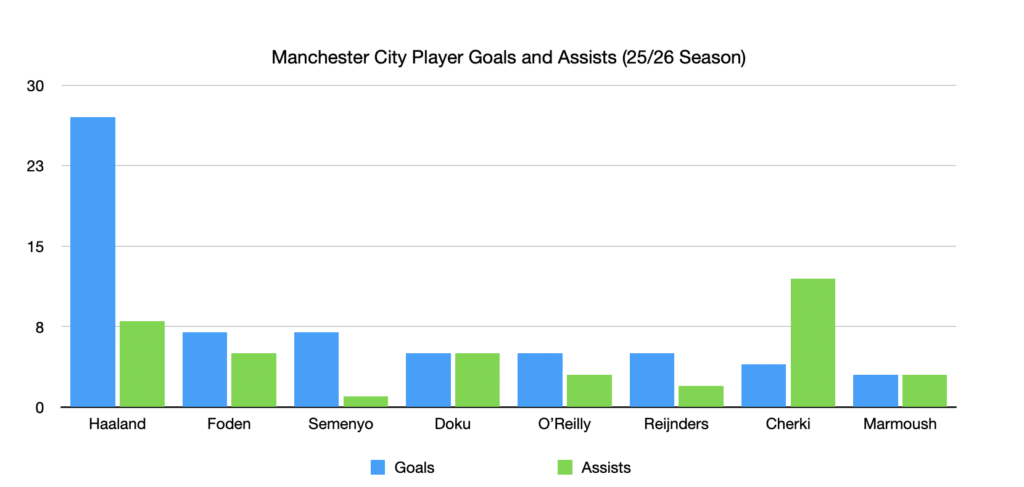
Soccer is one of my favorite sports, so I decided to visualize the goals and assists of Manchester City players during the 2025–26 season. I used a grouped bar chart because it allows me to compare two related statistics for each player at the same time. From the chart, it is easy to see that Haaland scored the most goals, while Cherki contributed the highest number of assists.
I tried to follow several of Mayer’s Multimedia Learning Principles when creating this visualization. First, I applied the Coherence Principle by including only the essential information—player names, goals, assists, and a simple title—without adding unnecessary decorations or distracting graphics. I also used the Signalling Principle by giving goals and assists different colours, making it easier to distinguish between the two categories. Finally, I followed the Spatial Contiguity Principle by placing the legend directly below the chart and keeping all labels close to the corresponding bars, allowing viewers to understand the information quickly without searching around the page.
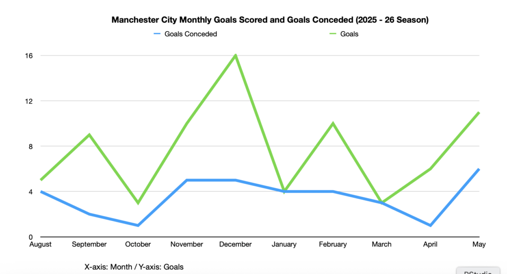
For my second visualization, I created a line chart showing the number of goals Manchester City scored and conceded each month during the 2025–26 season. Unlike the first chart, which compares individual player statistics, this visualization focuses on the team’s overall performance throughout the season. A line chart is the best choice because it clearly shows changes and trends over time. For example, the team scored the most goals in December, while the number of goals conceded remained relatively consistent in most months.
When designing this chart, I applied several of Mayer’s Multimedia Learning Principles. I used the Signalling Principle by assigning different colours to goals scored and goals conceded, making it easy to distinguish between the two lines. I also followed the Coherence Principle by including only essential information, without unnecessary decoration. Finally, I applied the Spatial Contiguity Principle by placing the legend and labels close to the graph so viewers can quickly understand the data without searching for information.
This week’s Daily Creates showed me that data visualization is an effective way to communicate information. By using both a grouped bar chart and a line chart, I learned that different chart types are useful for different purposes. The bar chart helped compare player statistics, while the line chart highlighted changes in the team’s performance over time. I also became more aware of Mayer’s Multimedia Learning Principles, especially the importance of keeping visualizations simple, organized, and easy to understand. Overall, this activity demonstrated how well-designed charts can make data more engaging and meaningful than presenting numbers in a table.
Leave a Reply
You must be logged in to post a comment.